
Elementor, Plugins, WordPress
The Biggest Comparison: Elementor Containers vs. Sections? Which One’s Better for You?
Dec
Are you exploring the comparison between Elementor Containers vs. Sections?
If so, you’re in the right place. Let’s dive into it together!
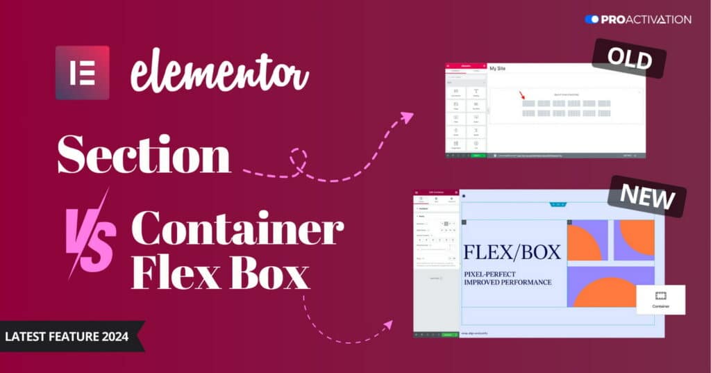
Elementor 3.6 brought in a new feature called Flexbox Containers. It presents a fresh layout approach, simplifying website design for better performance.
The Flexbox containers represents a step forward from the familiar section-column layout, bringing incremental improvements.
The section-column layout, with its use of sections, sub-sections, and columns, made website designing easier. However, it lacked flexibility in terms of design.
Elementor’s old layout made websites easy but had limits. Each section had few options, slowing sites. It was hard for mobile designs. Switch to Flexbox for better, faster, and flexible websites.
To learn Elementor Flexbox containers, follow this guide, we’ll explain why it’s better than the old way of doing things with sections and columns.
What is a Flexbox Container in Elementor?
Elementor Flexbox containers are Elementor’s way of using the CSS Flexbox model in their page builder. CSS Flexbox is a modern web layout powered by CSS 3, designed for better performance and responsiveness on different devices and screen sizes.
Flexbox Elementor containers enable you to create web pages that respond to different devices, similar to CSS Flexbox.
These Elementor containers hold all your page elements like text, images, and widgets. The exciting part is you can nest containers within containers.
If you’re familiar with the standard sections-column layout, you know the challenges of working with multiple layouts. Flexbox simplifies this process.
Unlike other layouts, such as block or inline, Flexbox allows you to place containers within containers limitlessly, opening up endless possibilities for unique layouts and designs.
In simple terms,
Containers in Elementor are like sections, but they provide flexibility at both individual and global levels.
This flexibility extends to alignment, padding, and inline positioning.
Let’s delve into the advantages of Elementor Flexbox Containers and how they compare to Sections.
Key features and functionalities of containers.
- Standard Sections:
- Websites are commonly divided into sections like introductions, hero sections, and calls to action. Containers provide more flexibility for designing these sections. You can easily add images, text, and buttons while controlling the direction, alignment, and spacing of content.
- Card Layouts:
- Flexbox containers excel in creating card layouts by arranging multiple containers in rows and columns. This allows precise control over alignment, span, and wrapping. Nested containers in Elementor further enable diverse content widgets within each card.
- Hero Image Galleries:
- Flexbox’s ability to nest child containers endlessly makes it ideal for crafting image galleries. Whether it’s a horizontal or vertical flow, you have control over white spaces, image sizes, and additional elements like text and buttons.
- Theme Builder Templates:
- Containers are perfect for crafting templates for headers, footers, or single-page elements. Create a basic layout using containers, save it, and reuse it across multiple pages. The content within these containers is mobile-responsive, adapting to various screen sizes.
- Centered Elements:
- Unlike the section-column structure, which posed challenges in vertically centering items, containers make it easy. Set alignment and justification properties to center items within the container, simplifying the task.
Elementor Flexbox Containers represent a significant shift from the traditional section-column layout. Let’s delve into the advantages of Flexbox Containers and how they compare to Sections in Elementor.
Containers vs. Sections: How Are They Different?
Let’s compare Elementor Containers and Sections in terms of technical variation, visual distinction, and performance impact.
1. Technical Variation:
Sections: These serve as a framework to structure elements on a webpage, such as widgets and text. You can divide sections into columns for organizing content.
Containers: Unlike sections, containers offer more flexibility in organizing webpage elements. They don’t have a fixed grid; instead, you can place containers within containers. Widgets within sections are full-width, while in containers, they are inline by default. This allows for accommodating numerous elements within a parent container, with automatic adjustments in alignment, positioning, and size.
2. Visual Distinction:
Sections: Retain the classic page builder user interface with a left-sided dashboard for accessing widgets and settings. The Navigator displays divisions and sections.
Containers: Maintain the familiar page builder UI but with noticeable changes. The Navigator now shows containers and their contents. To add elements, you choose a container and direction instead of sections and columns. Container-centric options like direction, alignment, justify, element gap, and warp are introduced.
3. Performance Impact:
Sections: Conventional Elementor sections have a display property set as “block,” leading to vertical stacking of new sections or widgets. Achieving a side-by-side display requires creating multiple divisions and DOMs, potentially impacting website speed.
Containers: Flexbox containers use a “flex” display property, allowing components to be stacked vertically or horizontally within a container. This eliminates the need for extra divisions, resulting in cleaner code execution and significantly reduced webpage load times.
The performance disparity between Flexbox containers and the section-column layout is substantial, especially in websites with intricate designs and sub-sections.
Pros of Using Elementor’s Flexbox Containers
Using Flexbox Containers instead of traditional blocks provides several advantages. Let’s explore why Elementor Containers vs. Sections debate leans towards Flexbox.
- Precise Control Over Page Layout: Flexbox containers provide a high level of control over content positioning and page layout. You can easily create horizontal or vertical layouts and customize the direction, alignment, padding, width, etc., at both individual element and global levels.
- Responsive Layouts for Devices: The flexible sections are specifically designed for smaller devices. You have the flexibility to adjust the layout for different screen sizes, including desktops, tablets, and mobiles. This ensures that all content on your web pages is adapted to various devices, enhancing accessibility for users.
- Clean Markup: Unlike the traditional block approach that creates DOM bloat with multiple sections or horizontal divisions, Flex containers allow horizontal content placement without the need for columns and sections. This results in clean and efficient website code that loads faster on different devices.
- Infinite Nested Sections: Traditional block builders had limitations, allowing only one sub-section within a section. Flexbox, however, enables the addition of containers within containers infinitely. This flexibility allows you to create more complex layouts without cluttering the markup with excessive DOM.
- Clickable Sections: Previously, only widgets within a section could be made clickable, not the entire section. With Flex containers, Elementor now allows you to hyperlink an entire section. This is a crucial feature for end users, as they can now click on the section itself to navigate to another page without searching for specific clickable elements within it.
How to Use Elementor Flexbox Containers: A Simple Step-by-Step Guide
Learn how to use Elementor Flexbox Containers with this step-by-step guide. We’ll demonstrate the transition from the section-column structure to the Flexbox Container.
The experience of using Elementor Flexbox for page building is similar to the regular Elementor block builder. Whether you’re new to Elementor or transitioning from the old builder, adapting to it is straightforward.
You may have questions like, “How do I enable/activate a container in Elementor? How do I use containers in Elementor? How do I add a container in Elementor?” This segment gives solutions to those queries.
To help you get started, here are the steps to use Flexbox containers for designing a website:
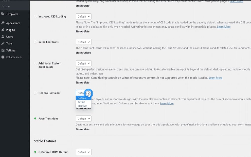
Step 1: Activate Flexbox in Elementor Settings
To utilize the new containers, you need to enable Flexbox. Navigate to Elementor settings in the WordPress dashboard. Click on the Experiment tab, scroll down to find the Flexbox container, and choose the Active option from the drop-down menu. Save the changes, and you may continue to the following step.
For new websites, the Flexbox container is already active by default.
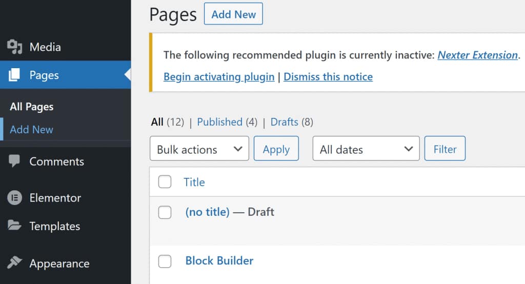
Step 2: Start a New Web Page
Next, create a new page as you usually would. Go to the Pages section, pick out All Pages, and click on Add New.
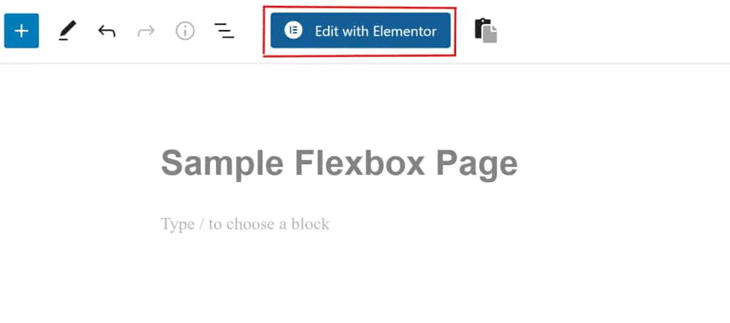
Step 3: Launch Elementor
Once you have the WordPress page builder window open, provide a title for the new page. Then, click on “Edit with Elementor” to get admission to Flexbox containers.
Step 4: Include a New Container
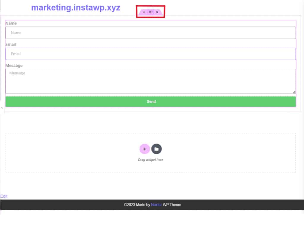
You’ll see the familiar Elementor page builder interface on your screen. To add a new container, either drag and drop it from the sidebar or click the + icon and choose a preferred structure.
![Add a new container how to use elementor flexbox container [ultimate guide] from the plus addons for elementor](https://theplusaddons.com/wp-content/uploads/2023/06/Add-a-New-Container.gif "Add a New Container | The Plus Addons for Elementor")
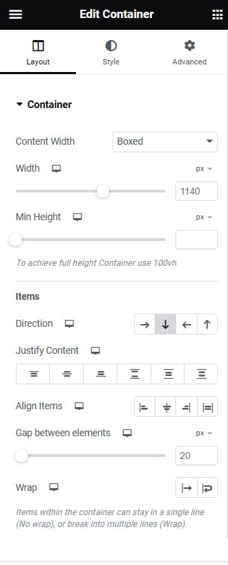
Step 5: Customize the Container
After adding a container, explore various customization options. Adjust settings such as container type, width, height, direction, alignment, and more according to your preferences.
Step 6: Place Widgets in Containers
Adding widgets to containers is straightforward. Choose the widget you want from the Elements tab, then drag and drop it onto the + icon within the container.
![Drag and drop widgets to containers how to use elementor flexbox container [ultimate guide] from the plus addons for elementor](https://theplusaddons.com/wp-content/uploads/2023/06/Drag-and-Drop-Widgets-to-Containers.gif "Drag and Drop Widgets to Containers | The Plus Addons for Elementor")
Step 7: Personalize Widgets
Similar to the overall container settings, you can also personalize the contents within a container. Customize options such as direction, alignment, justification, gap, wrap, etc., to suit your preferences.
![Customize widgets how to use elementor flexbox container [ultimate guide] from the plus addons for elementor](https://theplusaddons.com/wp-content/uploads/2023/06/Customize-Widgets.gif "Customize Widgets | The Plus Addons for Elementor")
Step 8: Publish Your Initial Flexbox Web Page
Feel free to create multiple containers, duplicate them, and rearrange their positions. Follow the steps as you add more elements, and when you’ve finished, click the Publish button to make your web page live. Alternatively, you can click the Preview button to interact with your new Flexbox web page.
How to Transform an Elementor Page from Section-Based to Flexbox Container: Step-by-Step Guide
Converting a section-column structure into a Flexbox container is simple. Follow these straightforward steps:
Step 1: Choose the Section
Select the section you wish to convert into a container by clicking on the six dots located at the top of the section. Alternatively, you can also choose the section from the Elementor Navigator pop-up.
Step 2: Transform the Section into a Container
After selecting a section, locate the CONVERT button in the Layout tab. Click on it to transform the section into a container.
Step 3: Adjust the Layout
Once the conversion is finished, you’ll observe two versions of the selected section. The top section is the original, and the bottom one is the newly created container. Remove the original section, and then click Update to save the layout.
![Update the layout how to use elementor flexbox container [ultimate guide] from the plus addons for elementor](https://theplusaddons.com/wp-content/uploads/2023/06/Update-the-Layout.gif "Update the Layout | The Plus Addons for Elementor")
Follow these steps for each section you intend to convert into a container.
Best Practices for using Flexbox Containers Efficiently
Discover best practices for efficiently using Elementor Flexbox Containers and making informed choices in the Elementor Container vs. Section dilemma.
1. How to Make a Flexbox Container Clickable
Creating an entire clickable column in WordPress can be a bit tricky. However, containers offer a solution by allowing the incorporation of an “a” HTML tag. This enables the entire container to become clickable. When website visitors click on this container, they will be directed to the link specified in the “a” tag.

To make any container clickable, start by choosing the “a” option from the HTML tag dropdown selector. This will reveal a link option below. Enter the desired URL using “https://” in the field or utilize dynamic options by clicking the stack icon.
You also have the choice to open the link in a new tab, add a nofollow attribute, or include additional custom attributes.
Important Note: When linking a container, avoid linking the child elements within the container. Nesting <a> tags can cause issues. Ensure that you unlink any child elements before applying a link to the container.
2. Evaluate the Performance of Flexbox Containers
In the given example, a section was brought in from the kit library, utilizing the traditional Elementor section approach. Subsequently, a container will be employed to achieve a similar outcome. This will allow for a straightforward comparison between the two methods.
Traditional Approach using Section / Columns / Inner Sections
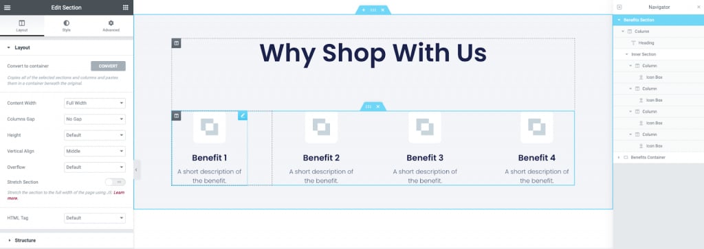
The previous example attains identical visual outcomes on the page; however, in this instance, a container is employed for the five elements. Noticeably, the number of elements in the navigator panel has been minimized. Explore further on how to create this benefits/services section.
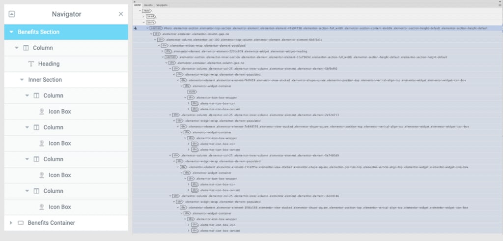
Taking a closer look
This examines the Document Object Model (DOM) of the traditional section. It’s evident that these five elements within the section generate a considerable number of nested div elements.
Examining the Document Object Model (DOM) of the container provides insight. Through the utilization of flexbox to manage the layout and widths of the child elements, there is a notable reduction in the number of div elements. This leads to improved page performance.
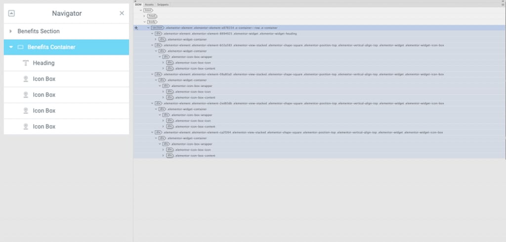
Results
The outcome of the aforementioned comparison between sections and containers is presented here. In this analysis, we solely focus on comparing the HTML output, while the reduction of CSS is not considered at this point.
3. How Many Containers Should Be Included on My Page?
Constructing a website using containers enables effective grouping and management of page elements. This facilitates the addition and modification of properties for multiple items, allowing for swift updates to the overall layouts. Nested containers offer the flexibility to create intricate designs and reusable templates, streamlining workflow processes.
A key advantage of utilizing containers lies in the ability to accelerate page loading times. The swift loading of pages enhances the user experience and contributes to improved search engine rankings.
To harness the full benefits of containers, it’s crucial to optimize the grouping of objects. In this article, we will explore the optimal use of containers for webpage design.
Now, let’s delve into efficient webpage design using containers.
Efficiently Design the Page You Desire
When designing your webpage, the primary goal is to achieve your desired outcome above all else. Within this objective, it’s advisable to use as few containers as possible.
This approach helps minimize the number of server requests and downloads necessary to construct the page, ensuring efficiency. In essence, the fewer containers used, the more efficient your webpage becomes.
A webpage’s structure and content are defined by the Document Object Model (DOM), outlining each part of a website as an object for programming languages to interact with.
While Elementor simplifies this process, it’s valuable to understand that a website’s DOM organizes each object node hierarchically, akin to the structure of headings and subheads in a book.
Containers provide a user-friendly way to design web pages according to your preferences. They allow control over item arrangement, style, and animation assignments.
With Flexbox Containers, you effectively create a DOM node that enables browsers to fetch the necessary data seamlessly from the server hosting the website. This results in faster page loading times and heightened responsiveness.
When Do I Determine the Need for a New Container?
Several factors dictate the number of containers necessary for a webpage:
Direction:
- The orientation of a container determines whether widgets inside are arranged in rows or columns. If you need a mix of elements in both rows and columns, two separate containers are necessary.
Example: Alex wants a container for a list of artworks in columns with images of the paintings in rows. They create a container with a column direction and a nested container with a row direction.
Ease of Use:
- Sometimes, it’s simpler to employ a separate container rather than searching for alternatives. For instance, when designing a hero section with a large background, creating that section as its container is more convenient.
Design:
- Grouping widgets based on commonalities or design preferences may prompt using the same container. For example, if widgets share the same background, hover effect, border, or scrolling effect, placing them in a single container is practical.
Functionality:
- Creating a new container for functional purposes is often beneficial. For example, placing frequently used widgets into a single container, saving it as a template, and reusing it on future projects streamlines workflow.
You can also create a separate container for widgets you want to move as a group.
Responsiveness:
- Separating containers per breakpoint provides a more optimized approach to managing responsiveness. This allows elements of one container to appear before those of the second. Nested containers may be necessary to ensure widgets display in the correct order on different screen sizes.
Note: Adding elements to containers is possible without nested containers. If your nested container only contains one element, there’s a good chance a container may not be needed.
Some Common Mistakes to Avoid When Using Elementor Flexbox Containers?
A typical error to steer clear of when working with Elementor Flexbox containers is overusing nested containers. This can unnecessarily complicate your layout and potentially lead to slower website loading times.
Frequently Asked Questions
What sets apart Elementor Flexbox Containers from Sections?
In Elementor, sections host full-width widgets on a page, while Flexbox containers have inline widgets within a container. Sections are rigid, allowing only one inner section, whereas Flex containers can be nested indefinitely.
Can I use Flexbox Containers with any WordPress theme?
Yes, you can use Elementor Flexbox containers with any WordPress theme. The Nexter WP Theme is recommended for full compatibility. Simply enable Flexbox containers in Elementor settings, and they will be accessible when you use the page builder.
How do I make my Elementor Flexbox Containers responsive on different screen sizes?
Elementor Flexbox containers provide options for ensuring content responsiveness. You can set the container content direction for displaying content in rows or columns. Additionally, you can align content both horizontally and vertically, determine when to wrap content for each element, and toggle widgets on/off based on the device.
Are Elementor Flexbox Containers well suited with all essential net browsers?
Yes, Elementor Flexbox containers are compatible with popular web browsers, including Chrome, Edge, Safari, and Firefox.
Wrapping Up
In conclusion, Elementor Flexbox Containers revolutionize the way we approach web design. The choice between Elementor Container vs. Section becomes clear as Flexbox offers superior flexibility and performance. The Flexbox Containers bring enhanced flexibility, improved design options, and better performance to webpage building.
We’ve discussed the key features, functionalities, and advantages of using Flexbox Containers, along with practical steps to implement them in your designs. Additionally, the guide covers the comparison between Elementor Containers and Sections, emphasizing the technical differences, visual distinctions, and performance impacts.
The article concludes with best practices, tips on making Flexbox Containers clickable, and insights into efficient webpage design using containers. Avoiding common mistakes, such as overusing nested containers, is highlighted to ensure optimal performance.
Overall, the guide provides a comprehensive overview of Elementor Flexbox Containers, empowering users to create efficient, responsive, and visually appealing web pages.
Join the conversation!
Share your thoughts, questions, or experiences with Elementor Flexbox Containers in the comments below. We’re here to engage with you, providing insights and clarifications. Let’s build a community where we can learn from each other. Your input is valuable, so feel free to leave a comment, and we’ll respond promptly.
Take advantage of our exclusive reader offer! Secure a lifetime license activation for Essential Addons Pro for Elementor for just $6.99. Don’t miss out on this special deal!
Read More Articles:
Crafting a Stunning Flutter App for Any WordPress Site with Ease
10 Best Free WordPress Themes with Demo Content for Easy Website Building
Enable Lazy Loading in WordPress using Perfmatters: A Step-by-Step Guide